Background
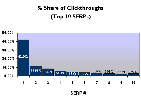
Back in 2006 the data from 20 000 000 search results were published by AOL much to the delight of data analysts and SEO specialists. There is speculation that this data may have been an accidentally leaked but whatever the true story is, the data was available for a period of time before it was removed by AOL. During this time, the data was analyzed by by a number of analysts and some interesting conclusions were drawn from the data. In particular, Red Cardinal estimated click probability as a function of ranking position in a paper labelled ‘SERP Click Through Rate of Google Search Results – AOL-data.tgz – Want to Know How Many Clicks The #1 Google Position Gets?‘
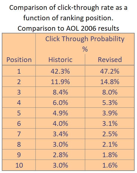
Of particular interest was the observation that the number 1 ranking position on Google received 42.3% of all clickthrough’s and his dropped to 11.92% for the second position and 8.44% for the third position. The conclusion at the time was that the top position received more than 4 times the traffic of the nearest rival. While this may have been an expected result, this was the first time that the magnitude had been quantified and the study was groundbreaking for SEO back in 2006 and still applies today.
We all know that the major search engines like Google and Bing use complex algorithms to rank pages for different search phrases and these algorithms change fairly regularly (https://www.searchenginejournal.com/google-algorithm-history/). Added to this, the layout of the Google results page has changed over time as Google moved adverts from the side of the page to the top of the page, then added more adverts etc. Users also have a better understanding of search and maybe don’t focus as much on the topmost result as they understand that other high ranking results can also add value to their search.
We decided to explore this in more detail to see if the click though value curve had changed since 2006. In order to do this, we first had to find a way to determine the click probability as a function of the ranking position. This article describes our methodology and our findings.
The methodology does not go into details on how to use Excel functions as this is beyond the scope of the article and it is assumed that anyone doing a similar analysis will be reasonably familiar with Excel.
How to determine click probability
In the absence of a large data set like that provided by AOL in 2006 we decide to use our own search data provided to us through Google Search Console. We used data from the past year and analyzed the data in Excel. A prerequisite to doing this analysis using our approach is that you have a Google Search console account that has been collecting data for at least 6 months.
Steps
Getting the data
- Log into Search Console and select your site.
- Select ‘Performance’ from the menu.
- Make sure that ‘Total clicks’, ‘Total impressions’ and ‘Average position’ are selected.
- Set the filters according to your needs (choose a long period and select the region you want to analyze).
- Export the results to CSV so that these can be analyzed on Excel.
- The file that is exported will contain a number of CSV tables in a zip file. Extract this file and open the file called Queries.csv.
- Rename and Save the file in .xls format before starting the analysis.
Analysing the data
In order to get a good dataset for analysis, we want to use only the records that have a high number of impressions (we used 100 for this exercise).
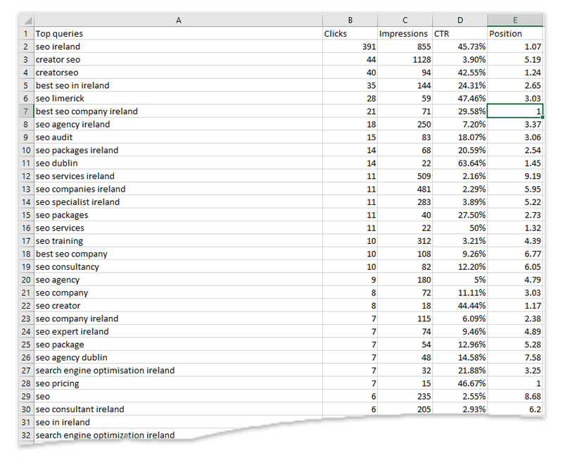
- The data will look similar to that shown in the image.
- Sort by impressions descending and then remove any records where there are less than 100 impressions.
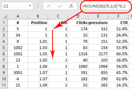
- Add a new column called ‘Bin’ and include the formula =ROUND(B2/0.2,0)*0.2 in this column. Copy this to all rows. This is an important step as it creates discrete intervals of Ranking data with a separation of 0.2. You can use a different interval by modifying the value in the formula.
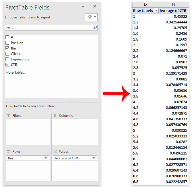
- Create a Pivot table using the Excel.
- Set rows to be the ‘Bin’ column.
- Set value to be the ‘Average CTR’ (Click Through Rate) as shown in the image.
Plotting the Chart
The data shown is all that is needed to plot the chart in the correct format.
- Insert a scatter Chart.
- Set the first column (labelled ‘Row Labels’ in our example) as the ‘Series X values’.
- Set the first column (labelled ‘Average CTR’) as the ‘Series Y values’.
- Label axes and format and style the chart as required.
The Click Probability Results
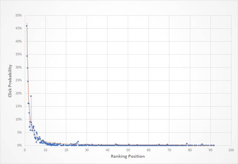
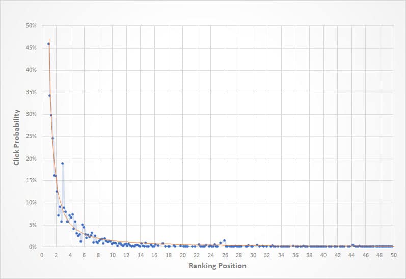
The charts show click Probability as a function of the Ranking position. Our results include a fitted line and there is more on this at the end of the article.
Conclusions
The shape of the curve remains the same as expected and the differences are surprisingly small compared to the 2006 AOL results.
The results from this analysis shows that 47.2% visitors will click through when the search result is in position 1. This drops to 14.8% for position 2 and 8% for position 3 for the industry analyzed in this work.
It is important to bear in mind that these click probability curves are likely to depend on the industry that is assessed. For example visitors wanting a quick answer to a search are likely to click on the first result they see. On the other hand, university researchers , bloggers or shoppers may be interested in all the results on the search results page.
Fitting the data
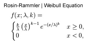
A function based on the Rosin-Rammler / Weibull equation was chosen for the data fit. The red line on the charts shows the data fit.
Previous work by CreatorSEO showed that this function provided a good fit to click throughs to the site based on search ranking. There were 3 parameters used in the fit as show in the equation on this page.
A best fit was calculated using the Microsoft Excel solver add-in to iterate through the parameters with the objective of minimizing the least squared deviation of the actual data from the fitted data.

